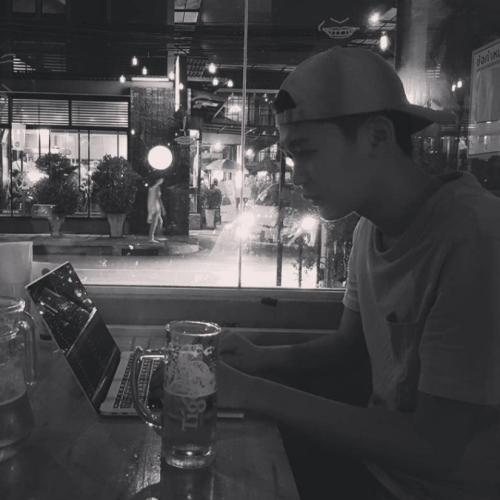
สวัสดีครับ พอดีวันนี้ผมกำลังนั่งทำหน้า about-me ในเว็บไซด์ klabban.com เลยนั่งคิดว่าจะทำออกมาแนวไหนดี เว็บไซด์นี้เขียนด้วย Next.js + WordPress(wp-graphql) และ support gutenberg editor 100% อยู่แล้วด้วยเทคนิคบางอย่างเดียวผมจะมาเล่าในอนาคต ถ้าผมไม่คิดอะไรมากก็สร้าง page ธรรมดาใน wordpress ด้วย gutenberg editor ก็ได้แต่มันไม่พิเศษพอ ผมเลยคิดว่าจะเพิ่มสีสันให้หน้านี้ด้วย Parallax Effect เทคนิคซักหน่อย
กดไปดูผลลัพธ์ก่อนได้เลยครับ Click!!!
ทำไมต้อง Framer Motion?
Framer Motion เป็นไลบรารี JavaScript ที่ใช้สำหรับการสร้าง animation ใน React applications โดยเฉพาะ ไลบรารีนี้ถูกพัฒนาขึ้นมาเพื่อช่วยให้นักพัฒนาสามารถสร้าง animation ใน React ได้อย่างง่ายและสะดวก โดยใช้ syntax ที่เข้าใจง่ายและทำให้การจัดการ animation ทำได้โดยไม่ซับซ้อน.
Framer Motion มีความยืดหยุ่นมาก สามารถใช้กับหลายประเภทของ animation ได้ เช่น การทำ transitions, keyframes, การควบคุมการเคลื่อนไหวของ elements, และอื่นๆ อีกมากมาย.
ตัวอย่างการใช้งาน Framer Motion
ตัวอย่างการใช้งาน Framer Motion ได้แก่การกำหนด variants และ transition สำหรับ elements ที่ต้องการให้มี animation:
import { motion } from "framer-motion";

const MyComponent = () => {
  const variants = {
    hidden: { opacity: 0 },
    visible: { opacity: 1 }
  };

  return (
    <motion.div
      initial="hidden"
      animate="visible"
      variants={variants}
      transition={{ duration: 1 }}
    >
      This is a Framer Motion animation!
    </motion.div>
  );
};
ในตัวอย่างนี้, มีการกำหนด variants สำหรับการทำ opacity animation และกำหนด transition ให้มี duration 1 วินาที.
ต่อไปเราก็มาเริ่มลงมือทำกันเลย
1. IDEA Stage
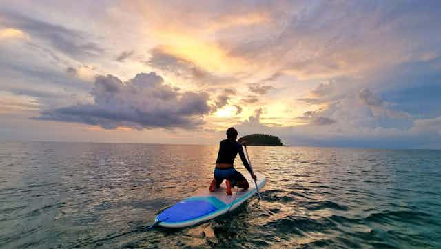
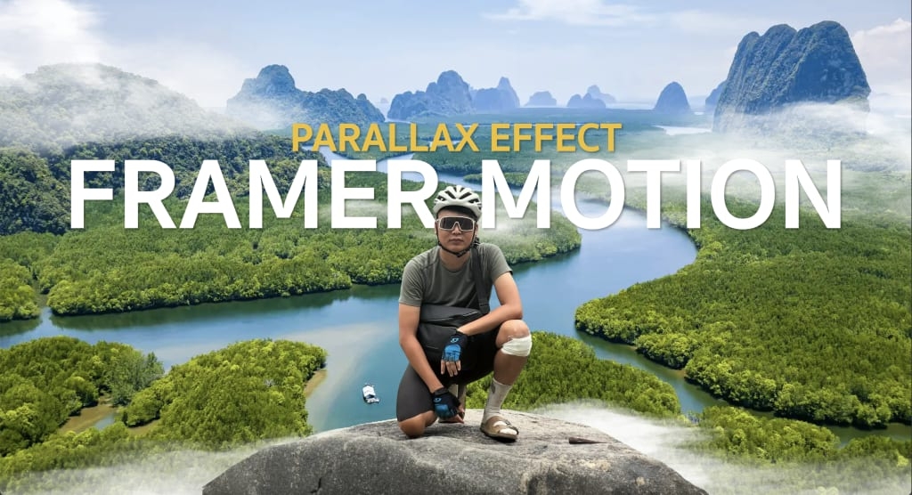
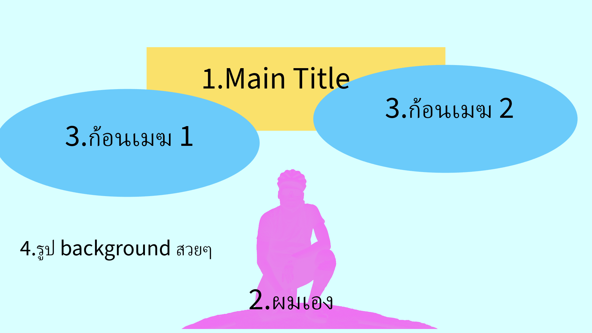
ไอเดียคร่าวๆก็คือจะมีคนเท่ๆคนหนึ่งนั่งอยู่บนก้อนหินโดยมี background เป็นทะเลไทยสวยๆพร้อมกับ Title subtitle และ description เท่ๆตรงกลาง สุดท้ายเพิ่มความเท่ด้วยก้อนเมฆสองก้อน
สรุปได้เป็น 4 ส่วนหลักๆดังภาพ
Animation
โดยการใส่ animation เป็นหัวใจสำคัญที่จะให้มันดูเป็น parallax effect โดยการเคลื่อนไหวหลักๆจะมีทิศทาง vertical (ขึ้นหรือลง) โดยจะมีความเร็วที่แตกต่างกัน ยกเว้นก้อนเมฆจะมีทิศทางการเคลื่อนไหวไปทางซ้ายและขวาเพื่อให้ดูมีสีสันเพิ่มขึ้นตามภาพด้านล่าง

2.จัดเตรียมภาพและตัวหนังสือ
2.1 เลือกรูปหลักและปรับแต่ง
เป็นการเลือกที่ยากมากเพราะเท่ทุกรูป… หยอกๆ
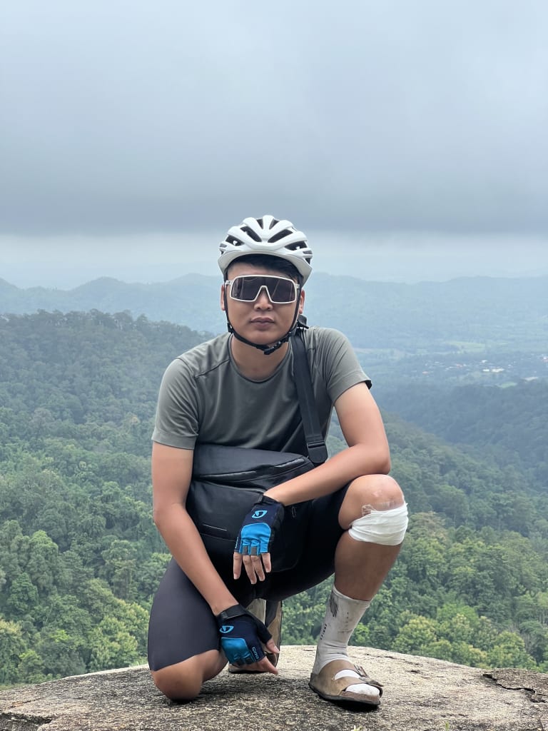
อย่างแรกเลยเราต้องเอา background ออกไปก่อนแล้วก็ต้องเติมหินที่ผมยืนอยู่ให้มันดูเต็ม ซึ่งวิธีการก็สุดง่ายด้วย adobe express ที่ผมเพิ่งกด free trial มา ด้วยความมหัสจรรย์ของ AI ผมกดคลิกเดียวพื้นหลังก็หายไปแบบเนียนๆ หลังจากนั้นผมก็ใช้ feature Generative fill ของ adobe เพื่อเติมพื้นที่ของหินให้ดูเต็มมากยิ่งขึ้น


หลักจากให้ AI ทำงานแล้วก็เลือกรูปที่ใช่ที่สุดแล้วผลลัพก็จะได้ประมาณนี้

2.2 Background Image
เนื่องจากผมได้กด free trial Adobe express ผมทำให้ผมสามารถเลือกภาพจาก adobe photo stock ได้ จนได้ภาพนี้มา

2.3 ก้อนเมฆ
ต่อไปเพื่อเพิ่มสีสันให้มากยิ่งขึ้นเราก็ไปหารูปก้อนเมฆมาซึ่งผมเราต้องการให้ก้อนเมฆมันโปร่งแสง สุดท้ายผมก็ได้รูปนี้มา แต่ตามแผนแล้วเราจะใช้ก้อนเมฆสองก้อนแต่เราสามารถใช้เทคนิคขยายมัน(CSS scaleX) ให้มันมีสัดส่วนที่แตกต่างกันไป ก็จะทำให้ก้อนเมฆดูเป็นคนละก้อนกันแล้วและยังทำให้เว็บไม่ต้องโหลดภาพมากจนเกินไปอีกด้วย

2.4 Typography หัวข้อและคำอธิบายต่างๆ
หัวข้อ ผมเลือกที่ใช้ใช้ชื่อเล่น และชื่อจริงเป็น Title และ Sub Title หลัก
คำอธิบายเพิ่มเติม ในส่วนของคำอธิบายเพิ่มเติมจะแบ่งออกเป็นสองส่วนคือ
- คำอธิบายโดยรวม
- skill set
3. จัดองค์ประกอบจริง
ต่อไปเรานำรูปและตัวหนังสือทั้งหมดมาจัดวางตาม idea ที่เราแพลนไว้ ซึ่งขั้นตอนนี้ใช้เวลาพอสมควรต้องจัดซ้ายจัดขวาและยังต้องทำให้ responsive อีกด้วย หลังจากใช้เวลาอยู่หลายชั่วโมง ซึ่งผมขอไม่ลงรายละเอียดนะครับ แต่จะได้ code ออกมาประมาณนี้ โดยหลักๆผมใช้ tailwind css
"use client";
import Image from "next/image";
export function AboutMeHeroBlock() {
return (
<div>
<div className="relative headline-shape text-white h-[100vh] w-full overflow-hidden bg-gray-200">
<div className="w-full h-[130vh] absolute bottom-0 left-0">
<Image
alt="ocean view"
fill
quality={50}
priority
src={"/images/sea-montain-cover.png"}
className="absolute bottom-0 right-0 object-cover"
/>
</div>
<div className="absolute w-full h-full text-center">
<p className="text-primary uppercase font-bold text-h3 lg:text-h2 md:leading-[60px] drop-shadow-xl custom-text-border">
Adisak Chaiyakul
</p>
<h1 className="text-[80px] sm:text-[140px] lg:text-[200px] font-bold font-title drop-shadow-xl leading-[80px] sm:leading-[140px] lg:leading-[170px] custom-text-border">
I'M OTTO
</h1>
<p className="sm:hidden p-4 rounded-xl text-h6 overflow-hidden break-words font-bold custom-text-border text-center">
I have developed an e-commerce solution tailored for small
businesses aiming to accelerate their growth in the online realm,
leveraging cutting-edge Headless-CMS technology.
</p>
</div>
<div
className="w-full h-full flex justify-center items-end absolute bottom-8 lg:bottom-0 lg:right-0 left-1/2 lg:left-auto ml-[-400px] lg:ml-0 min-w-[800px]"
style={{
translateY: "32%",
}}
>
<Image
alt="clound1"
width={1000}
height={1000}
quality={50}
src={"/images/clound1.png"}
className="object-cover absolute"
/>
</div>
<div
className="w-full md:w-1/2 h-1/2 md:-left-1/3 -top-40 flex justify-center items-end absolute bottom-8"
style={{
scaleX: "200%",
}}
>
<Image
alt="clound1"
width={1000}
height={1000}
quality={50}
src={"/images/clound1.png"}
className="object-cover absolute"
/>
</div>
<div
className="w-2/3 md:w-1/2 h-1/2 -right-1/4 top-0 flex justify-center items-end absolute bottom-8"
style={{
scaleX: "300%",
}}
>
<Image
alt="clound1"
width={1000}
height={1000}
quality={50}
src={"/images/clound1.png"}
className="object-cover absolute"
/>
</div>
<div
className="w-full h-full flex justify-center items-end absolute -bottom-10 right-0 lg:min-w-[800px]"
style={{
marginTop: 500,
}}
>
<Image
alt="hero"
width={1000}
height={1000}
quality={50}
src={"/images/otto-on-the-hill.png"}
className="object-cover absolute mb-20 sm:mb-16 lg:mb-0 scale-150 sm:scale-125 lg:scale-100"
/>
<div className="hidden absolute bottom-0 pt-20 w-full h-1/2 container max-w-5xl sm:grid grid-cols-3">
<div className="text-h5">
<div className="p-4 rounded-xl overflow-hidden break-words font-bold custom-text-border text-right">
I have developed an e-commerce solution tailored for small
businesses aiming to accelerate their growth in the online
realm, leveraging cutting-edge Headless-CMS technology.
</div>
</div>
<div />
<div className="text-h5 text-center">
<p className=" inline-block rounded-xl text-primary text-h4 uppercase text-center overflow-hidden break-words custom-text-border font-bold">
Technology I use
</p>
<div className="flex justify-center gap-4 items-center flex-wrap">
{[
"Wordpress",
"Graphql",
"Next.js",
"Tailwind CSS",
"Hasura",
"Postgress",
"Vercel",
"Headless CMS",
"SEO",
"GA4 Tracking",
].map((word) => (
<div
key={word}
className="px-3 py-1 rounded-xl bg-black/60 font-bold"
>
{word}
</div>
))}
<p></p>
</div>
</div>
</div>
</div>
</div>
</div>
);
}
ส่วนเรื่องของ coding นั้นผมตัดสินใจที่จะไม่ลงรายละเอียดในส่วนนี้ โดยหลักๆผมจะใช้ tailwind CSS เป็นหลัก แล้วก็ดูตัวอย่าง code ข้างบนเป็นแนวทางได้

อันนี้ต้องไปลองผิดลองถูกกันเอาเองนะว่าจะเพิ่ม Title เป็นยังไงจัดวางยังไง ส่วนตัวผมเลือกที่จะใช้ชื่อจริงและชื่อเล่นโดยใช้สีให้ตัดกันและเพิ่ม drop-shadrow นิดหน่อยให้ตัวหนังสืออ่านง่ายขึ้น
4. Animate with Frammer-motion
และแล้วก็ถึงเวลาที่เราจะได้นำ frammer-motion มาเพิ่มสีสันโดยการสร้าง parallax effect
4.1 track page scroll
หัวใจสำคัญของ parallax effect คือ เราต้องนำ % ของการ scroll เพจนั้นๆมาใช้กำหนดการเคลื่อนไหวของส่วนอื่นๆ โดยใช้ useScroll เพื่อติดตาม % ของ Main Wrapper หลักของเพจ โดยต้องใช้ useRef ของ React มาช่วย ซด้วยดัง code ด้านล่าง
import React, { useRef } from "react";
import { useScroll } from "framer-motion";

export function AboutMeHeroBlock() {
  const ref = useRef(null);
  const { scrollYProgress } = useScroll({
    target: ref,
    offset: ["start start", "end start"],
  });

  return (
    <div ref={ref} >  {/* main wrapper */}
      {/* your body */}
    </div>
  )
}
4.2 Parallax Effect
เมื่อเรารู้ % ของการ scroll page นั้นๆแล้วเราก็นำมันมาใช้เป็นตัวอ้างอิงการเคลื่อนไหวของแต่ละ Element ในหน้านี้ด้วยการใช้ useTransform. ซึ่งในแต่ละ Element จะมีอัตตราการเคลื่อนไหวทั้งแกน X และ Y ที่แตกต่างกัน สามารถดูตัวอย่างได้ตาม code ด้านล่าง
import React, { useRef } from "react";
import { useScroll, useTransform, motion } from "framer-motion";

export function AboutMeHeroBlock() {
  const ref = useRef(null);
  const { scrollYProgress } = useScroll({
    target: ref,
    offset: ["start start", "end start"],
  });

  const backgroundY = useTransform(scrollYProgress || 0, [0, 0.3, 1], ["10%", "40%", "80%"]);
  const heroY = useTransform(scrollYProgress, [0, 1], ["0%", "30%"]);
  const clound2X = useTransform(scrollYProgress, [0, 1], ["0%", "-40%"]);
  const clound3X = useTransform(scrollYProgress, [0, 1], ["0%", "40%"]);
  const cloundY = useTransform(scrollYProgress, [0, 1], ["20%", "150%"]);
  const titleY = useTransform(scrollYProgress, [0, 1], ["35%", "40%"]);

  return (
    <div ref={ref} >  {/* main wrapper */}
      <motion.div
        style={{
          y: backgroundY,
        }}
      >
        {/* background image */}
      </motion.div>
      <motion.div
        style={{
          x: clound2X,
          y: cloundY,
        }}
      >
        {/* clound1 on the left */}
      </motion.div>
      <motion.div
        style={{
          x: clound3X,
          y: cloundY,
        }}
      >
        {/* clound1 on the right */}
      </motion.div>
      <motion.div
        style={{
          y: titleY,
        }}
      >
        {/* title & subtitle*/}
      </motion.div>
      <motion.div
        style={{
          y: heroY,
        }}
      >
        {/* hero */}
      </motion.div>
    </div>
  )
}
4.3 Additional Animation
ในแต่ละ Element ผมเพิ่ม animation เล็กๆน้อยๆ เช่น
- fade in หลังจากโหลดเพจนั้นเสร็จเพื่อให้ดูตื่นตาตื่นใจเพิ่มขึ้นอีกนิด
- loop animate ทำให้เมฆเหมือนจริงมากขึ้นด้วยการขยับมันทีละน้อยไปมาเป็น infinite loop animation
4. Result
เมื่อรวมทุกอย่างเข้าด้วยกันก็จะได้ผลลัพธ์ดังนี้และสามารถดู demo ได้ตามลิ้งนี้เลย
"use client";
import { motion, useScroll, useTransform } from "framer-motion";
import { useRef } from "react";
import Image from "next/image";
export function AboutMeHeroBlock() {
const ref = useRef(null);
const { scrollYProgress } = useScroll({
target: ref,
offset: ["start start", "end start"],
});
const backgroundY = useTransform(
scrollYProgress || 0,
[0, 0.3, 1],
["10%", "40%", "80%"]
);
const heroY = useTransform(scrollYProgress, [0, 1], ["0%", "30%"]);
const clound2X = useTransform(scrollYProgress, [0, 1], ["0%", "-40%"]);
const clound3X = useTransform(scrollYProgress, [0, 1], ["0%", "40%"]);
const clound2Y = useTransform(scrollYProgress, [0, 1], ["20%", "150%"]);
const titleY = useTransform(scrollYProgress, [0, 1], ["35%", "40%"]);
return (
<div>
<div
ref={ref}
className="relative headline-shape text-white h-[100vh] w-full overflow-hidden bg-gray-200"
>
<motion.div
className="w-full h-[130vh] absolute bottom-0 left-0"
style={{
y: backgroundY,
}}
>
<Image
alt="ocean view"
fill
quality={50}
priority
src={"/images/sea-montain-cover.png"}
className="absolute bottom-0 right-0 object-cover"
/>
</motion.div>
<motion.div
className="absolute w-full h-full text-center"
style={{
y: titleY,
opacity: 0,
}}
initial={{ opacity: 0, paddingTop: 100 }}
animate={{ opacity: 1, paddingTop: 0 }}
exit={{ opacity: 0 }}
>
<p className="text-primary uppercase font-bold text-h3 lg:text-h2 md:leading-[60px] drop-shadow-xl custom-text-border">
Adisak Chaiyakul
</p>
<h1 className="text-[80px] sm:text-[140px] lg:text-[200px] font-bold font-title drop-shadow-xl leading-[80px] sm:leading-[140px] lg:leading-[170px] custom-text-border">
I'M OTTO
</h1>
<p className="sm:hidden p-4 rounded-xl text-h6 overflow-hidden break-words font-bold custom-text-border text-center">
I have developed an e-commerce solution tailored for small
businesses aiming to accelerate their growth in the online realm,
leveraging cutting-edge Headless-CMS technology.
</p>
</motion.div>
<motion.div
className="w-full h-full flex justify-center items-end absolute bottom-8 lg:bottom-0 lg:right-0 left-1/2 lg:left-auto ml-[-400px] lg:ml-0 min-w-[800px]"
style={{
opacity: 0,
scaleX: "400%",
translateY: "32%",
}}
// animate={{ opacity: 1 }}
// transition={{ delay: 0.2, duration: 4 }}
animate={{ marginRight: [-200, 300, -200], opacity: 1 }}
transition={{
duration: 60,
repeat: Infinity,
opacity: {
duration: 1,
},
}}
>
<Image
alt="clound1"
width={1000}
height={1000}
quality={50}
src={"/images/clound1.png"}
className="object-cover absolute"
/>
</motion.div>
<motion.div
className="w-full md:w-1/2 h-1/2 md:-left-1/3 -top-40 flex justify-center items-end absolute bottom-8"
style={{
x: clound2X,
y: clound2Y,
scaleX: "200%",
}}
// initial={{ marginLeft: -400 }}
animate={{ marginLeft: [-400, 400, -400] }}
transition={{ duration: 60, repeat: Infinity }}
>
<Image
alt="clound1"
width={1000}
height={1000}
quality={50}
src={"/images/clound1.png"}
className="object-cover absolute"
/>
</motion.div>
<motion.div
className="w-2/3 md:w-1/2 h-1/2 -right-1/4 top-0 flex justify-center items-end absolute bottom-8"
style={{
x: clound3X,
y: clound2Y,
scaleX: "300%",
}}
animate={{ marginRight: [-300, 300, -300] }}
transition={{ duration: 60, repeat: Infinity }}
>
<Image
alt="clound1"
width={1000}
height={1000}
quality={50}
src={"/images/clound1.png"}
className="object-cover absolute"
/>
</motion.div>
<motion.div
className="w-full h-full flex justify-center items-end absolute -bottom-10 right-0 lg:min-w-[800px]"
style={{
y: heroY,
marginTop: 500,
}}
initial={{ opacity: 0, bottom: -100 }}
animate={{ opacity: 1, bottom: 0 }}
transition={{ delay: 0.5, duration: 0.5, easings: 10 }}
>
<Image
alt="hero"
width={1000}
height={1000}
quality={50}
src={"/images/otto-on-the-hill.png"}
className="object-cover absolute mb-20 sm:mb-16 lg:mb-0 scale-150 sm:scale-125 lg:scale-100"
/>
<div className="hidden absolute bottom-0 pt-20 w-full h-1/2 container max-w-5xl sm:grid grid-cols-3">
<div className="text-h5">
<motion.div
className="p-4 rounded-xl overflow-hidden break-words font-bold custom-text-border text-right"
initial={{ opacity: 0, x: -100 }}
animate={{ opacity: 1, x: 0 }}
exit={{ opacity: 0 }}
transition={{ delay: 1, duration: 0.5 }}
>
I have developed an e-commerce solution tailored for small
businesses aiming to accelerate their growth in the online
realm, leveraging cutting-edge Headless-CMS technology.
</motion.div>
</div>
<div />
<motion.div
className="text-h5 text-center"
initial={{ opacity: 0, x: 100 }}
animate={{ opacity: 1, x: 0 }}
exit={{ opacity: 0 }}
transition={{ delay: 1.5, duration: 0.5 }}
>
<p className=" inline-block rounded-xl text-primary text-h4 uppercase text-center overflow-hidden break-words custom-text-border font-bold">
Technology I use
</p>
<div className="flex justify-center gap-4 items-center flex-wrap">
{[
"Wordpress",
"Graphql",
"Next.js",
"Tailwind CSS",
"Hasura",
"Postgress",
"Vercel",
"Headless CMS",
"SEO",
"GA4 Tracking",
].map((word) => (
<div
key={word}
className="px-3 py-1 rounded-xl bg-black/60 font-bold"
>
{word}
</div>
))}
<p></p>
</div>
</motion.div>
</div>
</motion.div>
</div>
</div>
);
}